
Our rebrand is a manifestation of our commitment to our customers. We want to empower you, to change the way you perceive and manage your finances, making it more accessible.
Claire Davidson
VP of Brand at Taxfix
Introduction
Today, Taxfix celebrates a significant milestone as we unveil our rebrand that is much more than a visual makeover. It's a reflection of our journey, our growth, and our commitment to empowering you with seamless financial solutions. This rebrand extends far beyond visual elements to include a refined brand strategy and product development.
Together with the creative agency Kallan & Co, we've crafted a new visual identity that truly reflects our mission of financial empowerment, simplifying financial processes and boosting financial literacy. Our focus is clear: to build a more personal and emotionally resonant brand that forges deeper connections with you by understanding and addressing your unique financial challenges and aspirations.
The promise to our customers is a product that is easy to use. The new Taxfix brand has been designed with that goal in mind.
Our rebrand is a manifestation of our commitment to our customers. We want to empower you, to change the way you perceive and manage your finances, making it more accessible.
Claire Davidson
VP of Brand at Taxfix

An Evolution of Our Heritage
Taxfix's logo redesign skillfully balances tradition and modernity, keeping the iconic % symbol and blending it with a contemporary font and sleek details.
Logo
An Evolution of Legacy
We've modernized the font, removed the punctuation on the “i”, and cut the “T” stem on the left, all with the expert touch of Schick Toikka . The result is a logo that breathes harmonic rhythm into our brand.
Typography
The Art of Expression
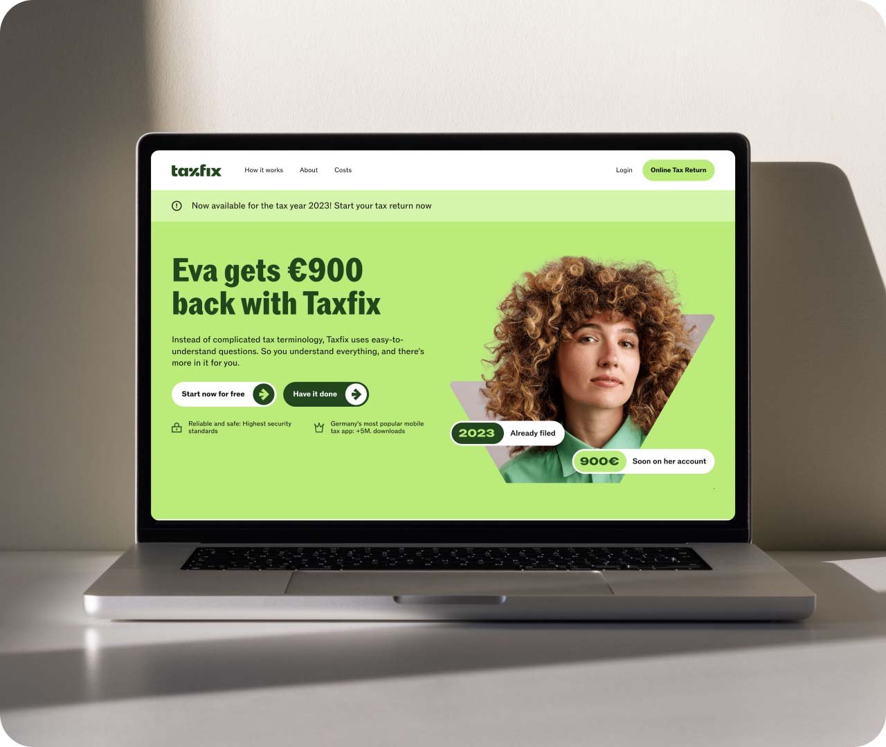
Typography is not just about letters and words; it's the voice of our brand. Our new typeface, ROM, created by ABC Dinamo , a Berlin-based Typefoundry, represents a leap toward maturity. It's a typeface that helps us express precision and expertise while conveying a sense of friendliness and a touch of humanity with its rounded punctuation. Whether you're reading our product descriptions or diving into a blog article, ROM's exceptional legibility shines through.

Color
A Palette of Vibrancy
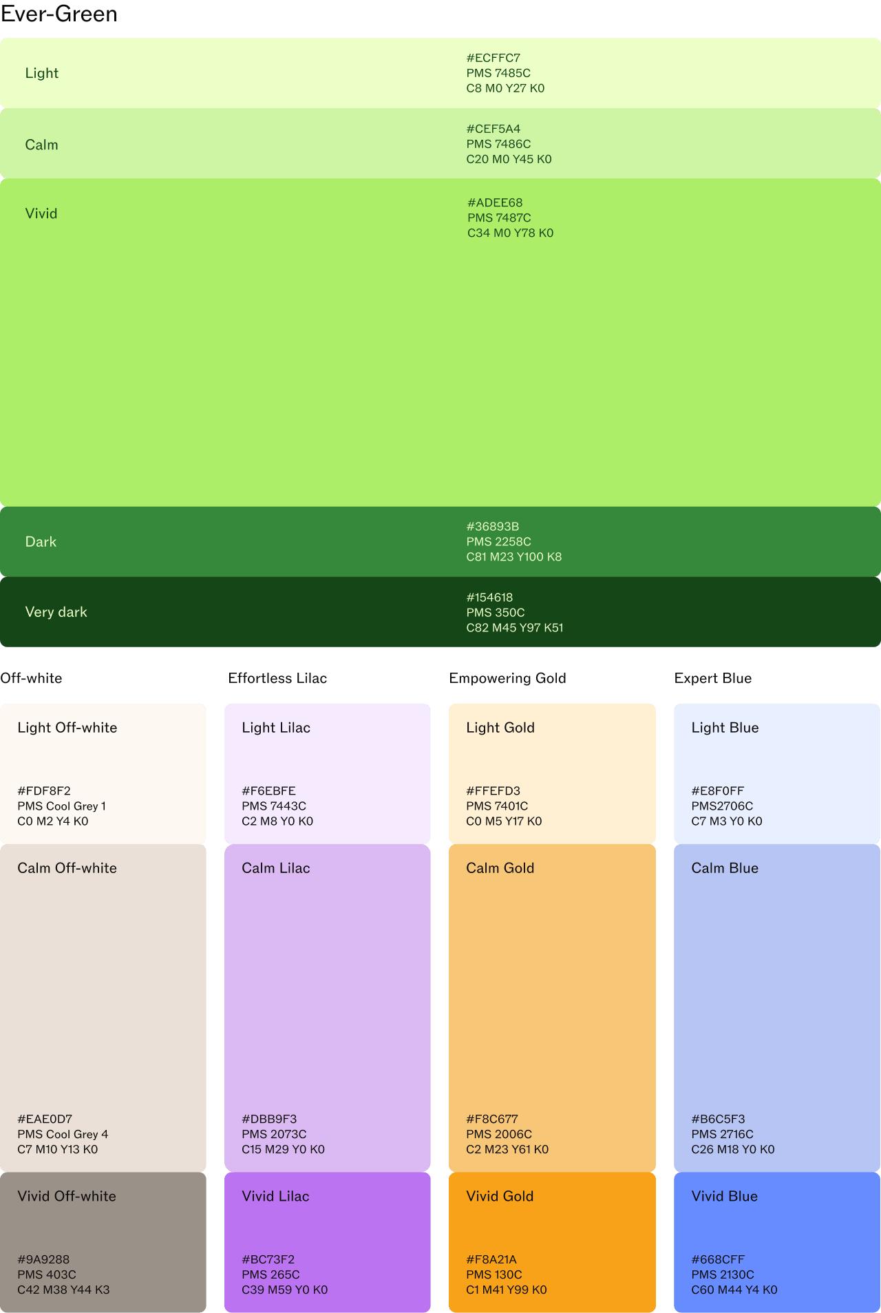
Our brand's vivid green is a symbol of trust and recognition. Through surveys and qualitative tests, we've discovered that you have a deep connection with this hue. We didn’t want to lose that familiarity. At the same time, to suit various contexts, we've expanded our palette to include an array of green shades.
But that's not all. We've introduced a set of secondary colors inspired by the Euro currency—lilac, gold, and blue. These colors breathe life into our brand: each hue has its own story to tell and its own purpose, from empowerment to effortlessness and expertise.
Art Direction
Capturing Authentic Moments
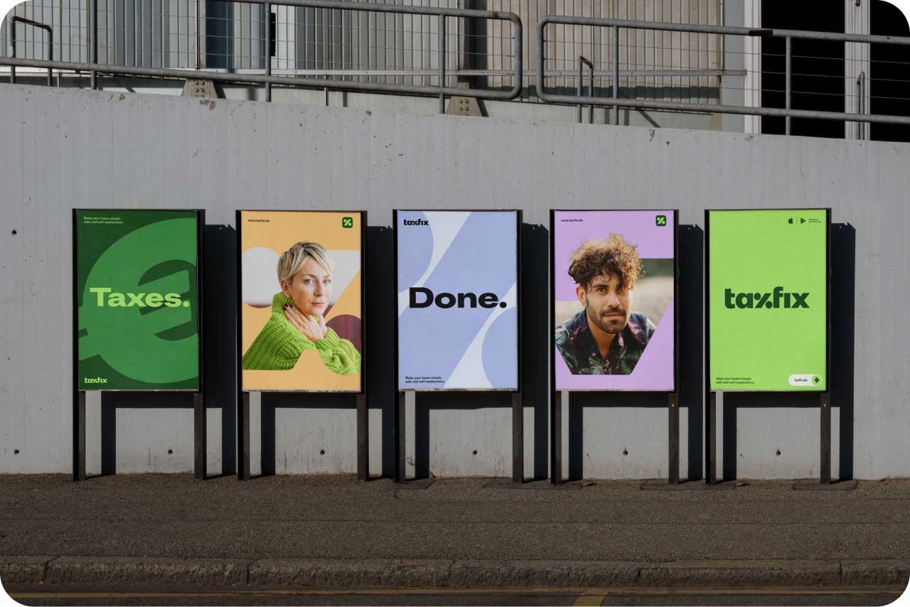
Art direction for us is more than just visuals; it's about storytelling about our customers and experts. Our aim is to capture the essence of confidence and relaxation that comes with using our products. We aim to authentically empower people of all ages and backgrounds, and we do it with a touch of natural lighting and genuine snapshots. Our approach is simple yet powerful: we bring our audience to eye level, creating a connection that's both authentic and empowering.
Financial Symbols
Our Unique Signature
Symbols drawn from the world of finance, like the “€” or percentage sign, are the building blocks of our new brand design. They add depth and energy to our visual identity. These symbols are the stage on which our customers and experts take center spotlight. In a crowded marketplace, these symbols set us apart, establishing a unique and instantly recognizable visual signature.
Illustrations
Bringing Personal Finances to Life
With their unique grainy, 3D look, our illustrations embody flexibility and innovation and bring a sense of familiarity and expertise. They are designed for all: our visuals aim to empower you and make complex tax concepts more engaging and digestible. They also stitch together our brand's presence across all users touchpoints, from our app to our blog, crafting a consistent and recognizable identity.

Product
Personalized Experience and Inclusivity
We recognize that every individual's financial needs are unique, whether they seek minimal assistance or a full Expert service. The rebrand empowers us to revamp our product experience to accomodate each user’s specific preference. By introducing a broader set of levers such as an expanded colour palette, functional illustrations and typography that fit into our product we are better equipped to distinguish our product range more effectively. This helps us better tailor the user experience, catering to users at their specific levels of need while ensuring a consistent and seamless journey from marketing to product touchpoints.
Inclusivity takes center stage in our product design. We've redesigned illustrations to represent a diverse range of users. The collaborative effort between marketing and product in crafting this new brand identity ensures our product’s alignment with accessibility principles, allowing us to adhere to usability standards throughout our offerings.
Our rebrand empowers us to enhance our product experience and make it more personalized, inclusive and user-centric. These views are part of our rebranded product vision that we'll be building towards.